USER STORY
Billboards & Traffic.
Measuring the impact of advertising.
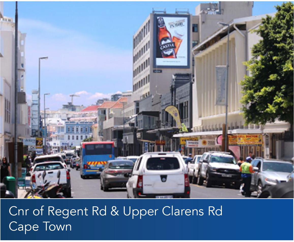
The Outdoor Measurement Council of South Africa (OMCSA) uses data such as satellite imagery, traffic flows and travel patterns to create a comprehensive traffic model in support of planning and operations. These models when used in combination with the Out of Home (OOH) billboards, creates an accurate representation of the audience passing a given billboard. One of the crucial factors in understanding the success of a billboard is the typical speed a person will travel when passing the billboard as this influences the content that can be displayed, the graphics themselves and also how quickly they can cycle an electronic billboard based on the time of day. OMC approached Esri South Africa to assist with calculating the drive-time statistics for 150 of their electronic billboards. The aim is to determine a count of passenger cars and the minimum, maximum and average speeds of these cars within a viewing range of the billboard at various times of the day and differing days of the week. These statistics help OMC to determine the optimal display time of a specific electronic advert on a given billboard. Billboard sites are valued by their location and the amount of traffic which passed them. The speed of the vehicles passing the billboard determines how they can be optimally utilized to maximise revenue and the return on investment. It also assists when advertising the billboard to prospective clients by illustrating the traffic and time people have to see the content.
Project Deliverables
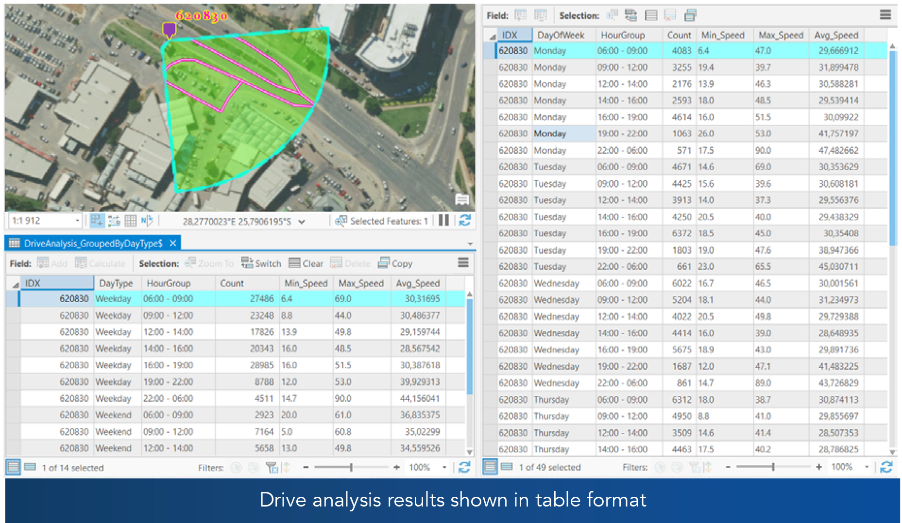
Esri South Africa was task to provide as summary as an Excel document including the following metrics:
• Minimum speed
• Maximum speed
• Average speed
• Number of cars (count)
The data was grouped by the following time-bands:
• 09:00 to 12:00 (Morning Peak)
• 12:00 to 14:00
• 14:00 to 16:00
• 16:00 to 19:00 (Afternoon Peak)
• 19:00 to 22:00
• 22:00 to 06:00
The data also needed to be grouped by:
• Weekday/Weekend
• Days of the week

Input Data
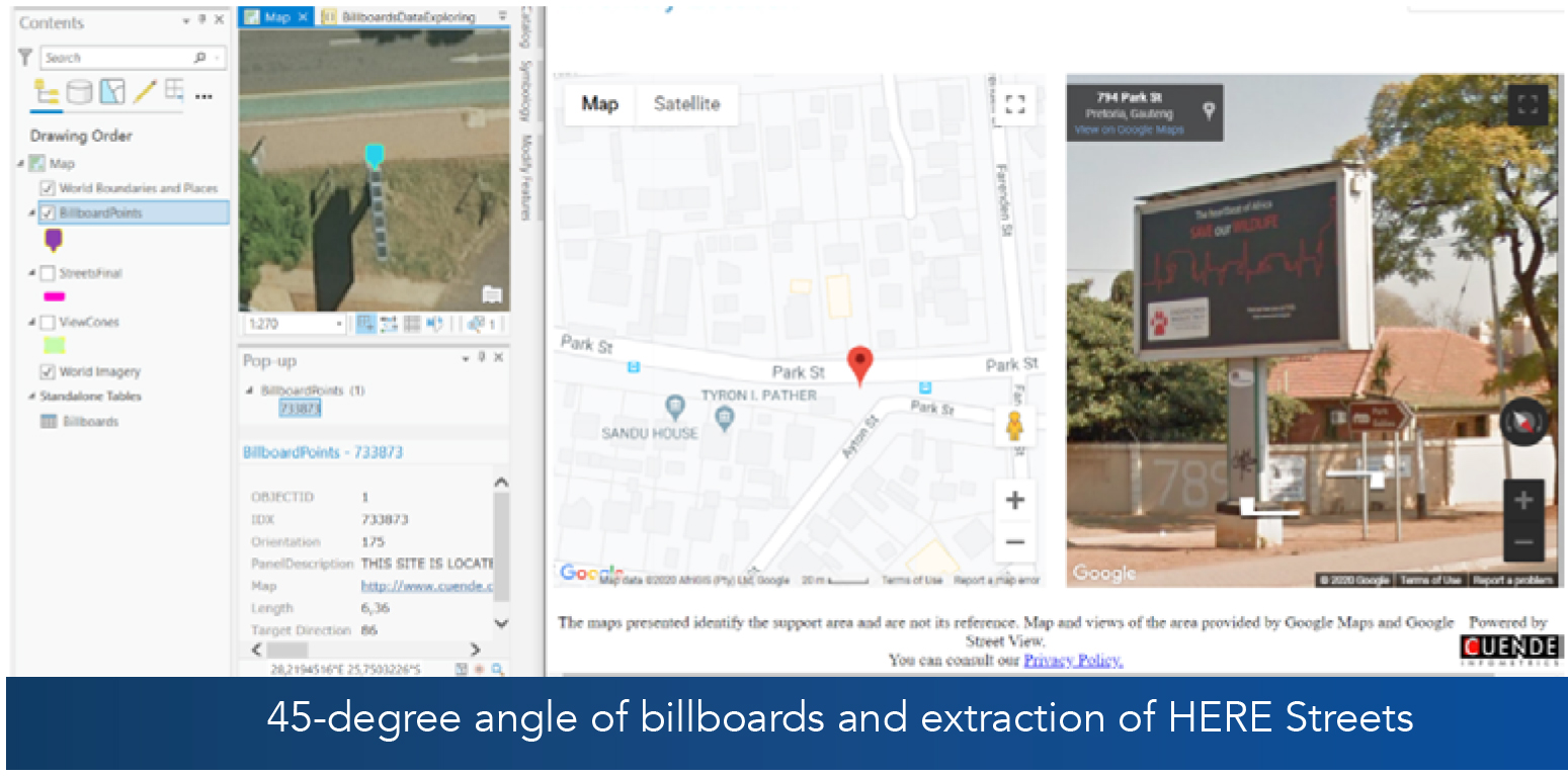
• The client provided the position of the 150 billboards (Phase 1 – 100, Phase 2 – 25 and Phase 3 – 25) as an Excel document. The billboards had Latitude and Longitude fields as well as a description and Google Street View links detailing the billboard.
• HERE Streets – 2018 Q4
• HERE Drive-Time Analysis datasets – 01 February 2020 to 29 February 2020
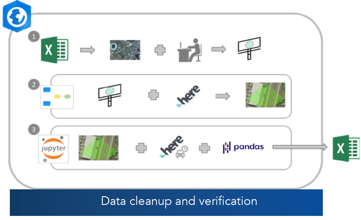
The process workflow is defined in the diagram below and took 18 minutes to run after all the data had been processed into an analysis ready format, which included the “mapping” of the billboards and verifying their positions and the street segments which are visible from each billboard.

Technical Solution – Workflow
The workflow used to achieve the analysis results can be divided into three parts:
1. Data cleanup and verification:
Used a combination of ArcGIS Online basemaps, CDNGI imagery and Google Street View to edit and verify the locations of the billboards.
2. Extract HERE streets:
The second step was to create a model that produced a 45-degree view angle of the billboards, before extracting the HERE streets that fall within the viewing range.
3. Summarise using Jupyter notebook:
The final step used Jupyter notebook within ArcGIS Pro to calculate the statistics. The Pandas python package was used to join the clipped HERE streets to the massive HERE drive-time analysis datasets (Gauteng alone has 211,292,740 entries for the month of February).


Output / Results

